MTN Uganda
Redesigning the MyMTN App: Boosting User Engagement
Telecommunication Enterprise UX
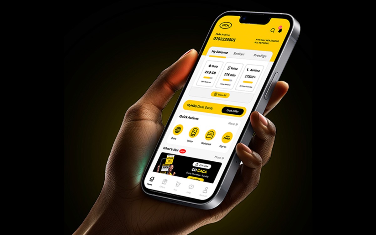
MyMTN is MTN Uganda’s flagship mobile app, offering users a one-stop shop for managing their account, buying data, sending money, and more. I led the redesign of the app to enhance usability and improve overall user satisfaction across a diverse and growing customer base.
Managing telecom services shouldn’t be frustrating.
Users were frequently reporting friction in navigating the app—long load times, unclear flows, and inconsistent UI patterns. The design didn’t reflect modern mobile standards, especially for users on lower-end devices. Our goal? Create a more intuitive, responsive, and inclusive experience that builds trust and loyalty.


Discovery + Research
Understanding real people behind the screen.
To uncover pain points and prioritize features, we ran usability tests and user interviews across urban and rural segments.
Insights revealed three key findings:
Users primarily accessed the app to buy data and check balances.
Many found existing flows too long or unintuitive.
There was high demand for a low-data, offline-friendly experience.
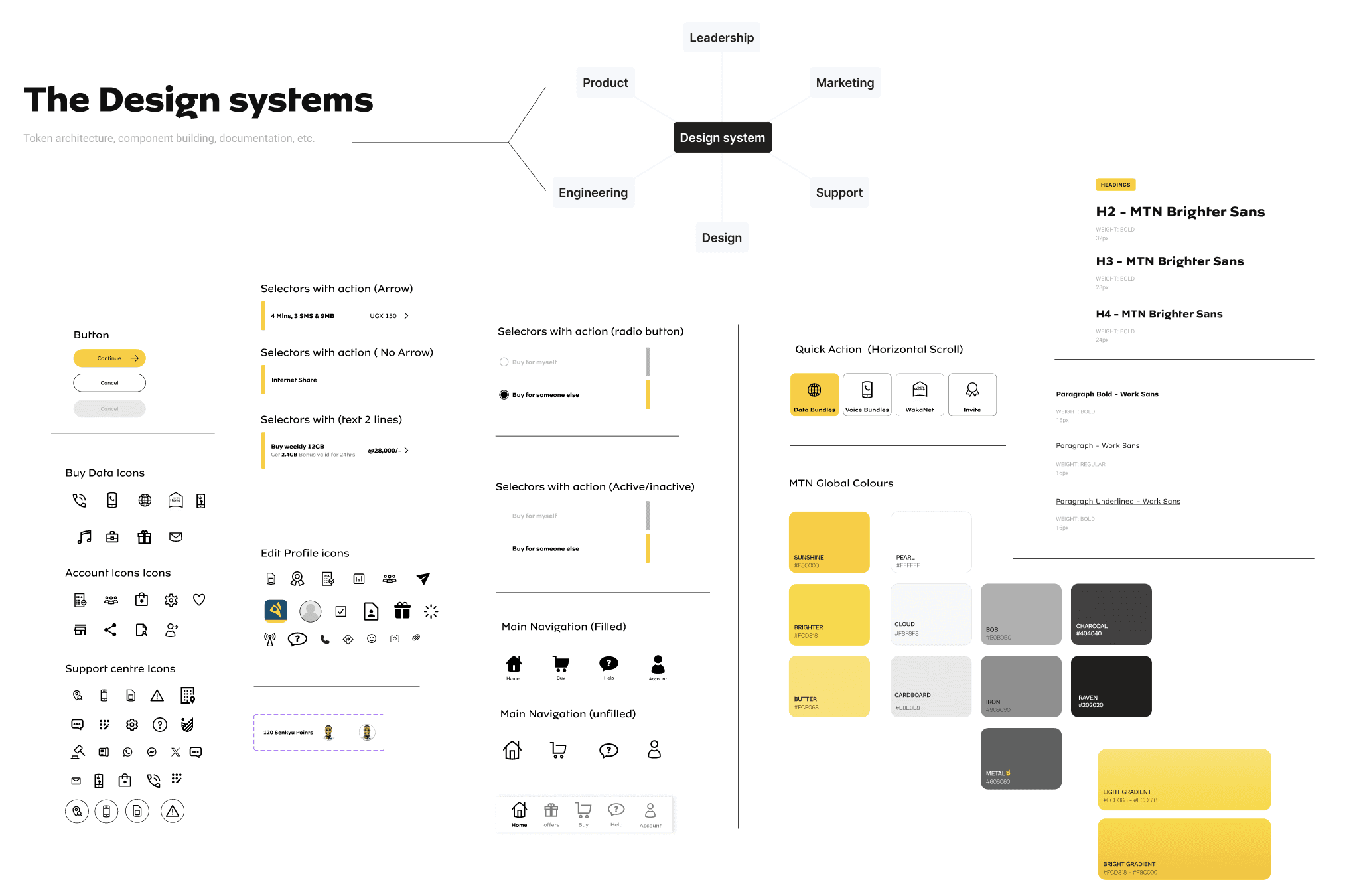
The Design
We started with wireframes to rework key journeys: data purchase, Airtime top-up, and MoMo transactions. High-fidelity prototypes followed, optimised for smaller screens and tested across device types.
What we did:
Reworked the bottom nav bar for easier access
Cleaner typography and visual hierarchy
Refined iconography for clearer navigation and usability


Outcomes
Takeaways